Challenge
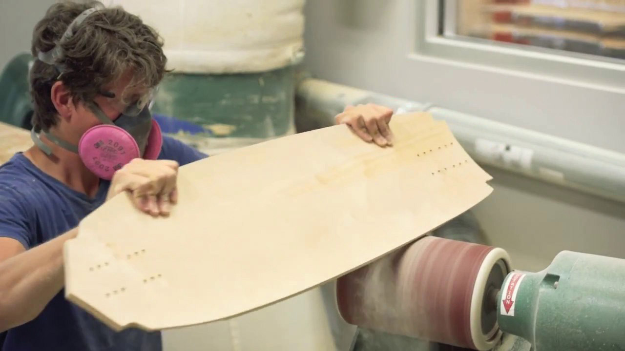
Liqwood Board Sports is a longbaord manufacturer in Denver. They started small, building boards in the owner’s garage, but now manufacture high quality boards on a large scale at the local skate shop. With new equipment and clients, Liqwood needs a brand that communicates the quality they bring to their customers. Currently, Liqwood’s brand doesn’t reflect how far they have come nor does it aim to excite the new audience. Due to this, the competition sells more boards even though they lack the quality of Liqwood. By looking at the audience and the competition I aim to more effectively communicate the quality, professionalism, and uniqueness of the brand.
Cutomer Audit
A look at Liqwood’s customers reveal there are two main audience members. One a kid looking to buy a board, the other looking to have his board manufactured for him. Both are hard workers and appreciate a professional product when they see it. In order to capture the attention of this audience the new brand must feature surreal, colorful, psychedelic art that is seen in the skate culture. This style must also communicate professionalism while remaining unique and not cliché.
Typography/Colors
Wordmark and secondary fonts
- Professional
- Sleek
- Sans Serif (will mostly be read on screens)

Colors
- Eye Catching
- Surreal
- Contrasting


Logo Drafts/Final
The original logo doesn’t communicate the quality that Liqwood provides. The bubble letters and splatter gave the logo an almost child like feel. I created the new logo to be more aggressive and professional. The infinity is kept to allude to the original logo and slogan, “infinite possibilities.” The wave is used instead of a splatter to represent the warped, almost liquid shape of the boards.
Original

Drafts

Final

Board Graphics
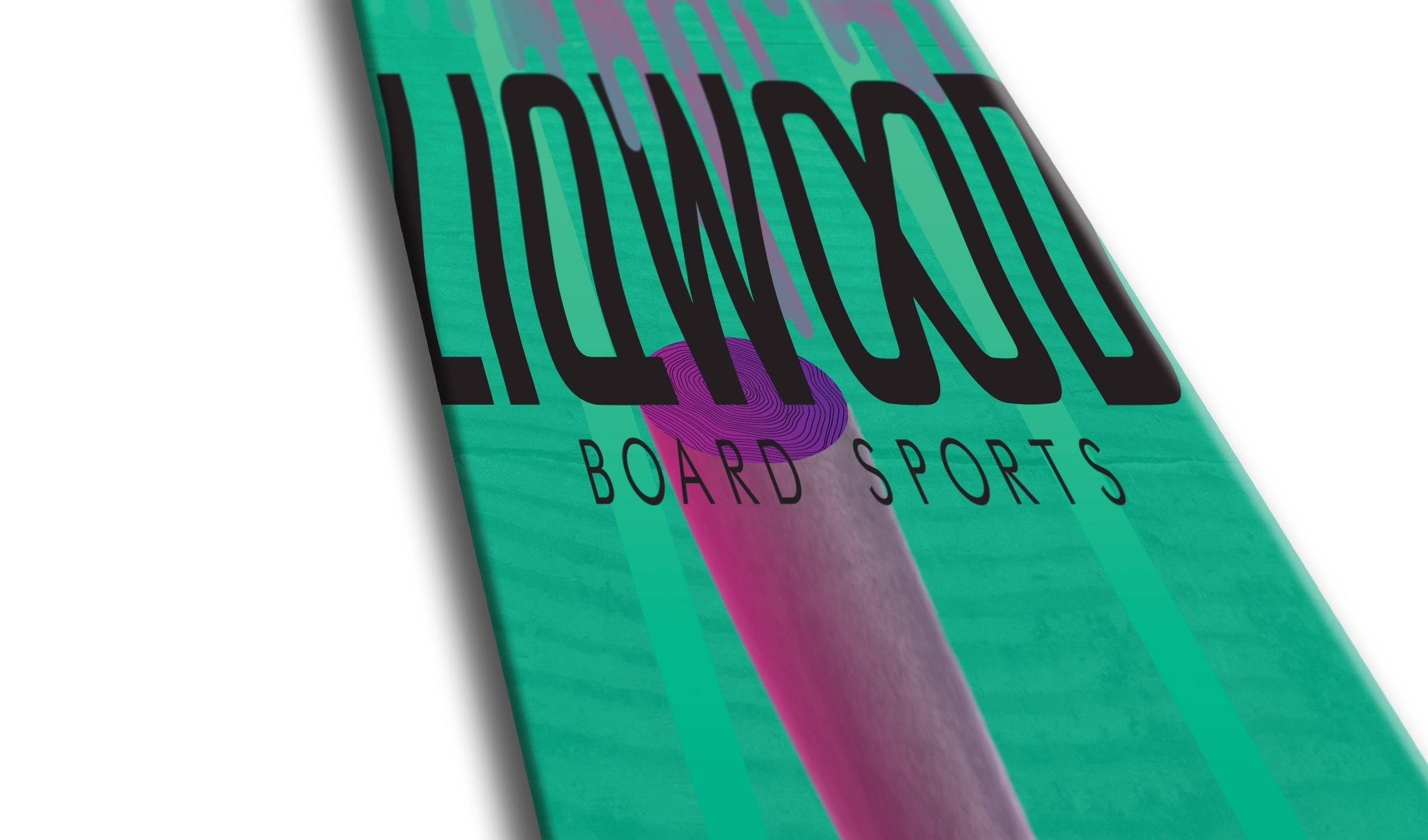
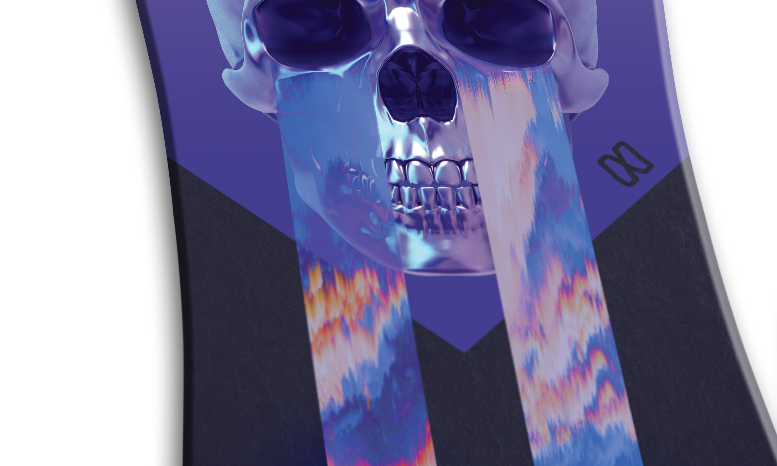
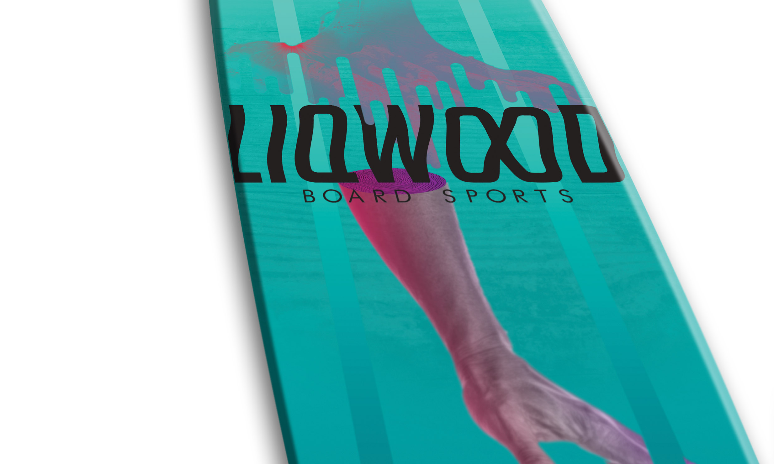
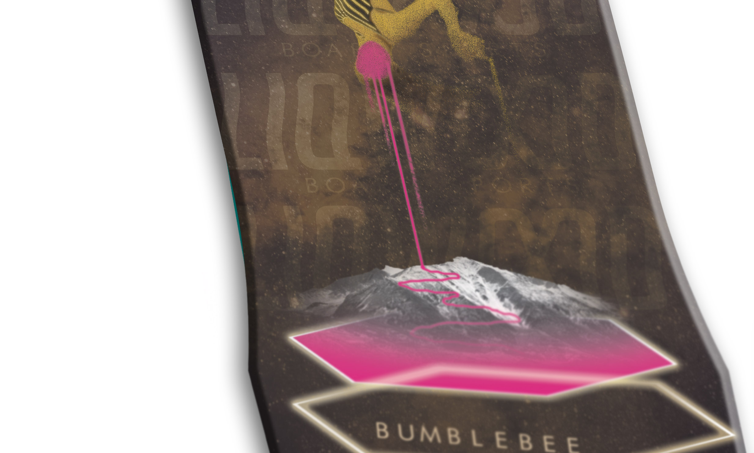
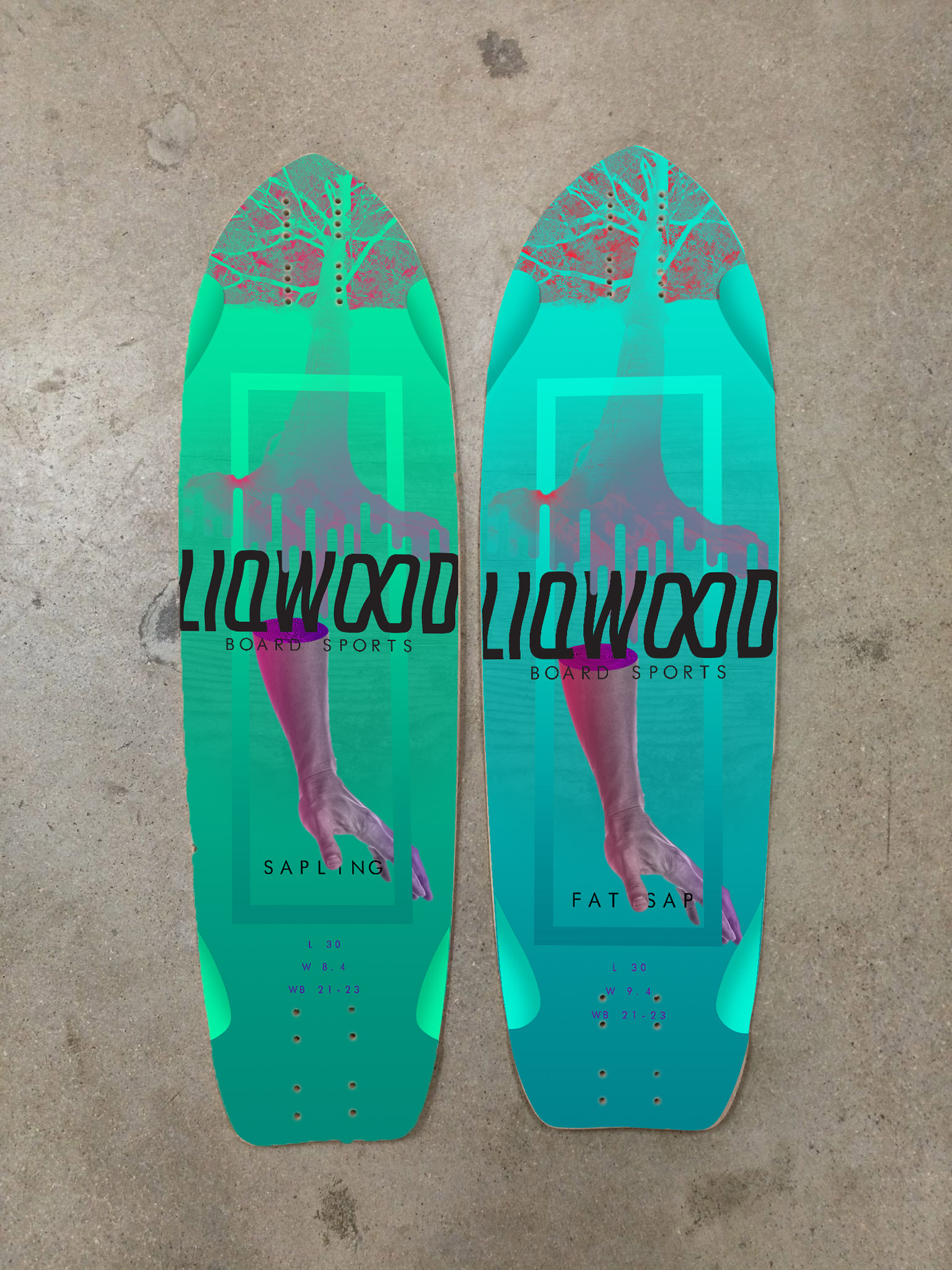
The board graphics are more eye catching and colorful than the original graphics. The imagery was inspired by themes found in the competition’s artwork while remaining unique to Liqwood.


Stickers/Website
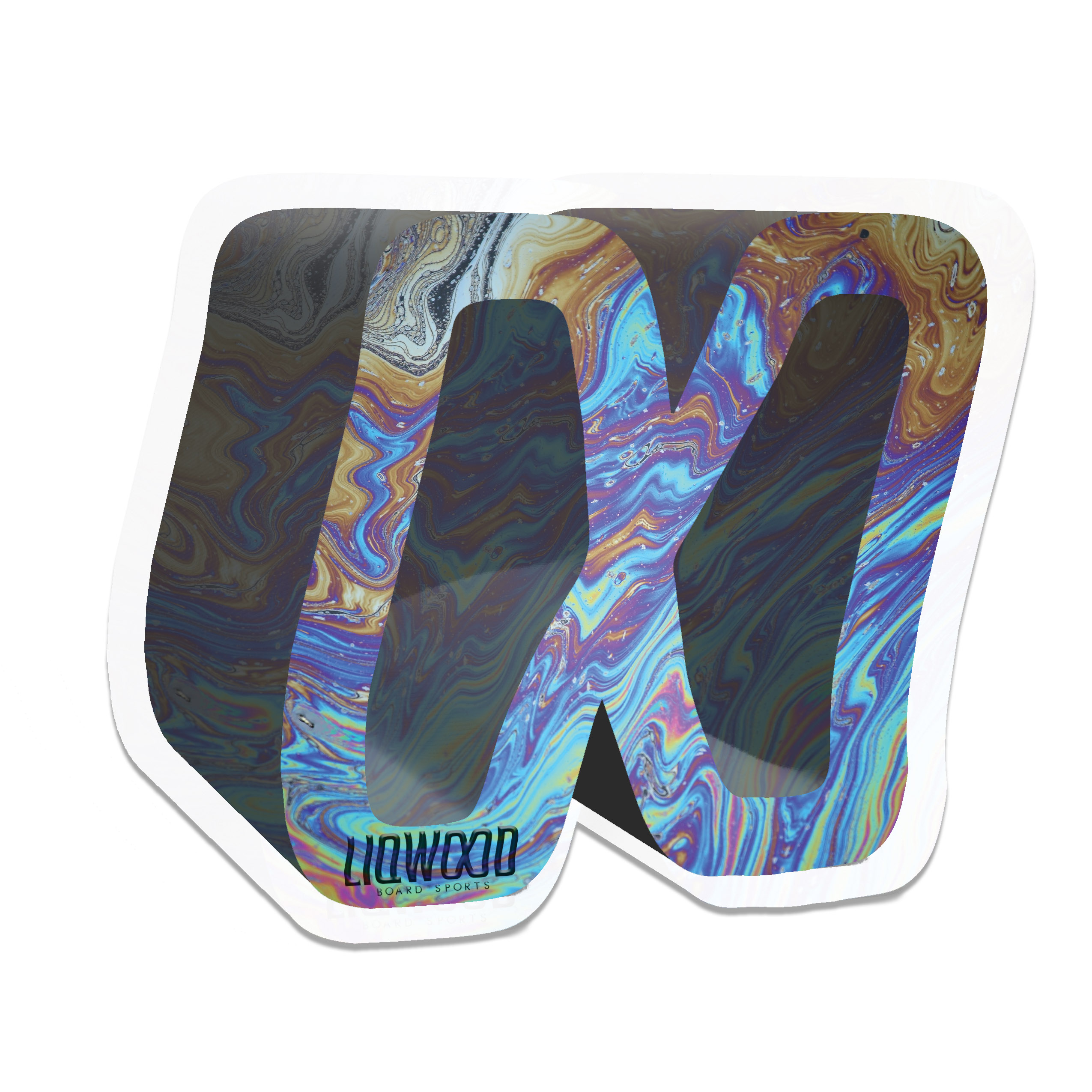
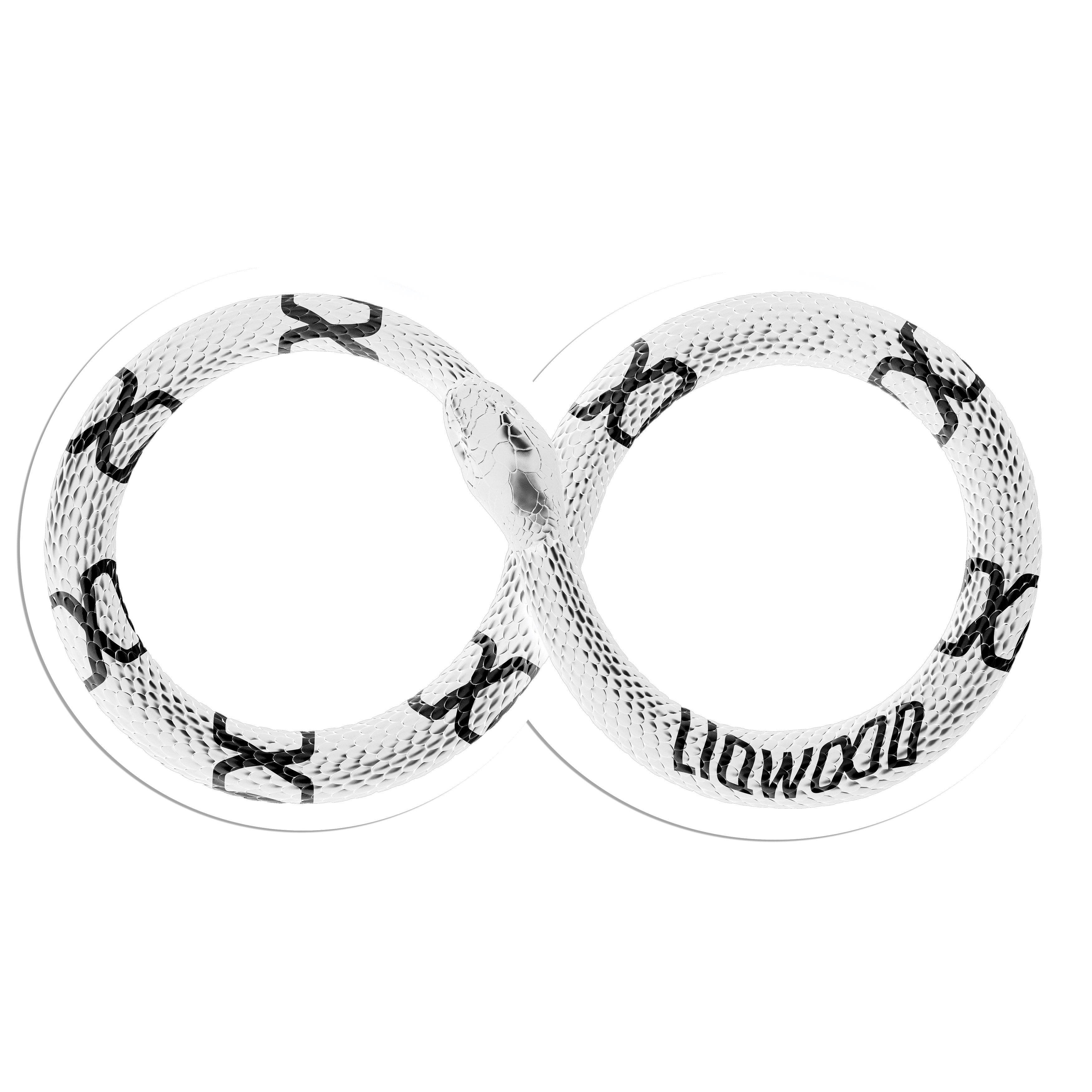
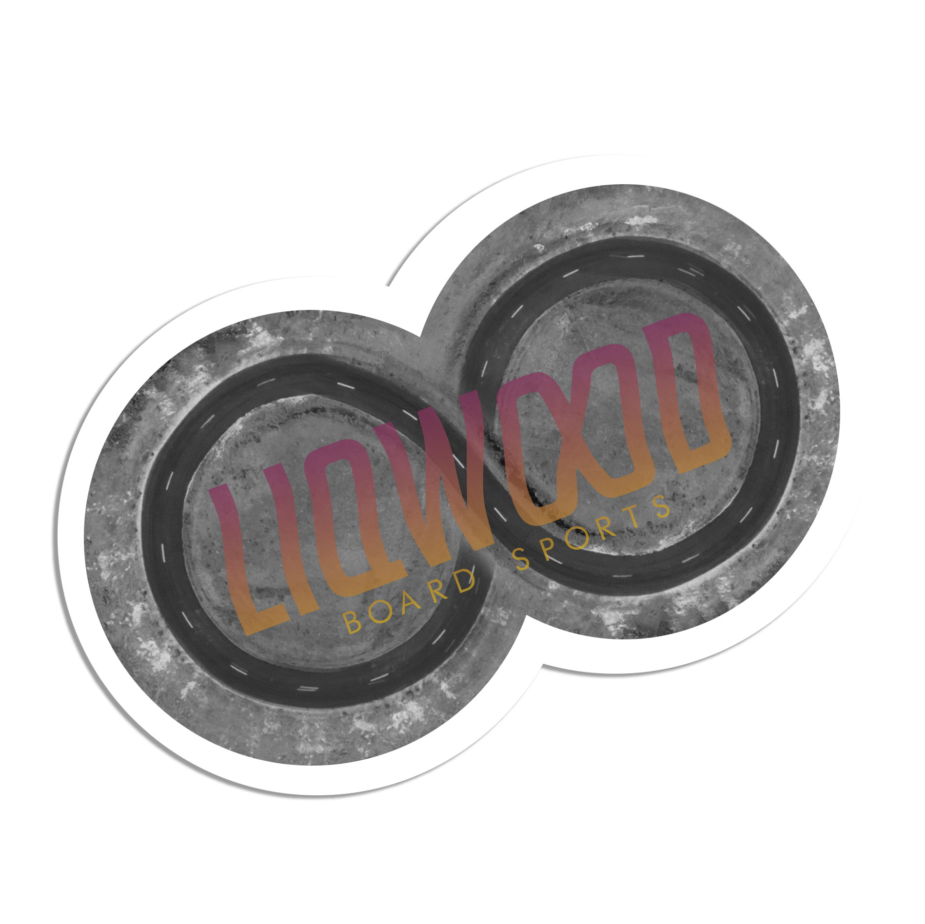
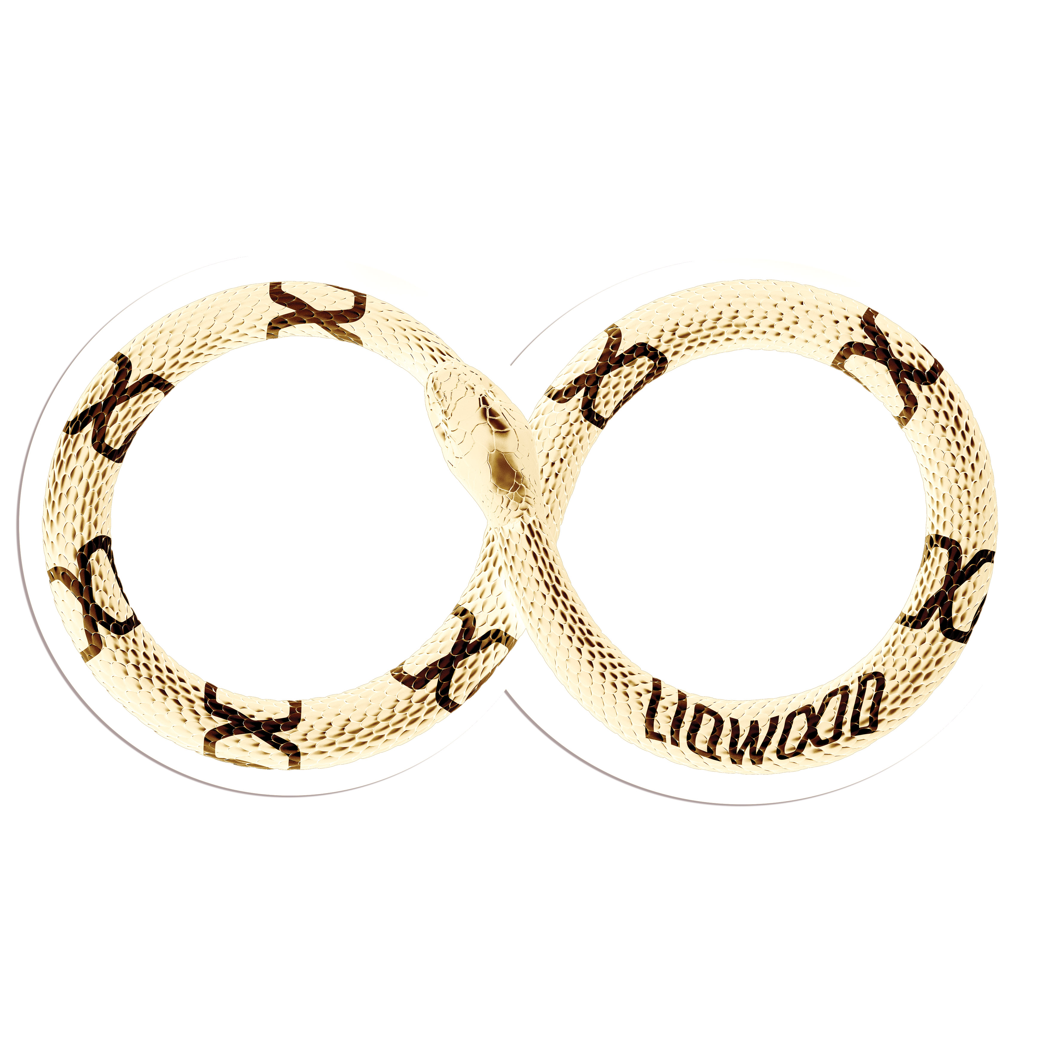
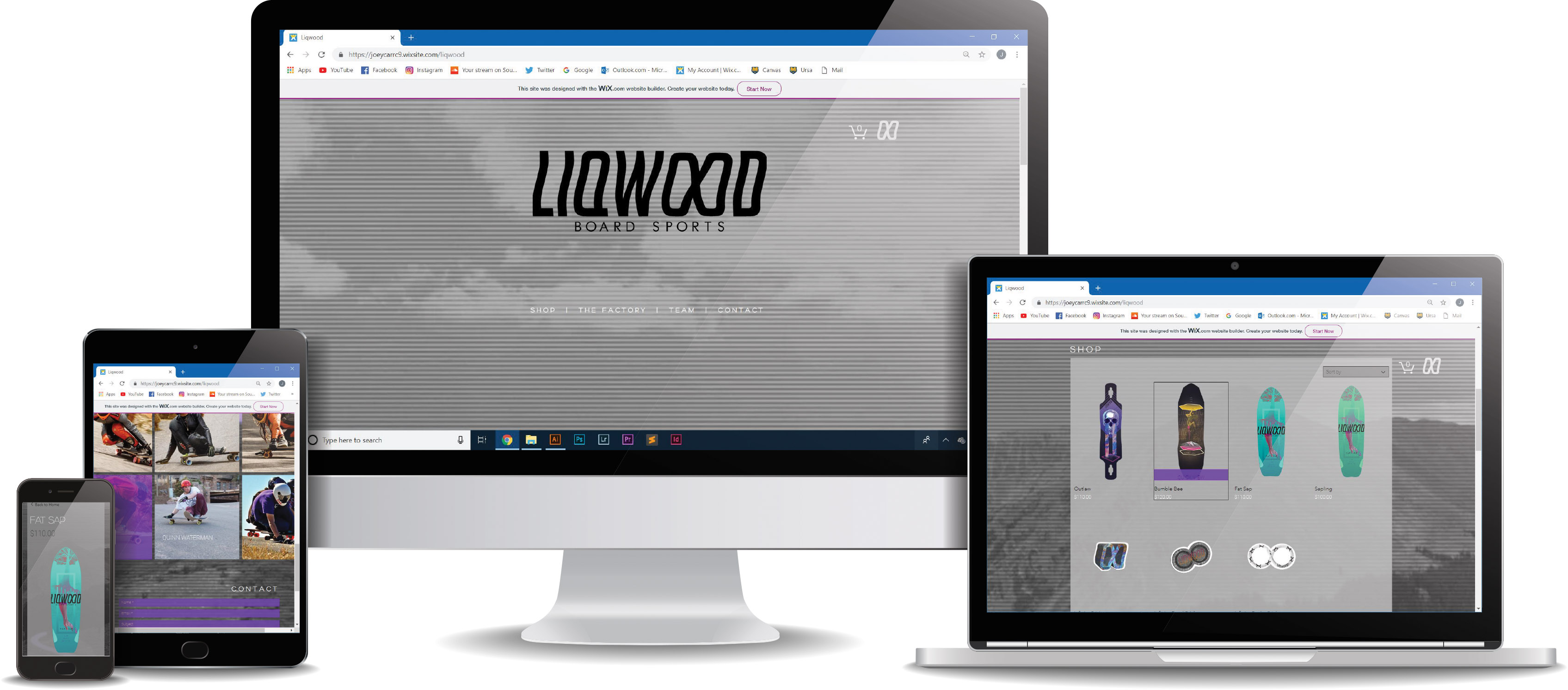
The stickers were designed with the same theme as the boards but were meant to reinforce the infinity symbol. The website follows this same theme but features minimal color in order to not distract from the products.
 HOME
HOME