
About the Brand
Tree Line is Colorado’s newest ski resort and boasts lots of unique features. The park prides itself on being innovative and environmentally friendly. The goal of this project is to produce a meaningful, effective, and long lasting brand identity and accompanying brand usage guide. All the touchpoints shown embody Tree Line’s commitment to be different. The usage guide empowers others to keep this experience throughout other touchpoints.
Objective
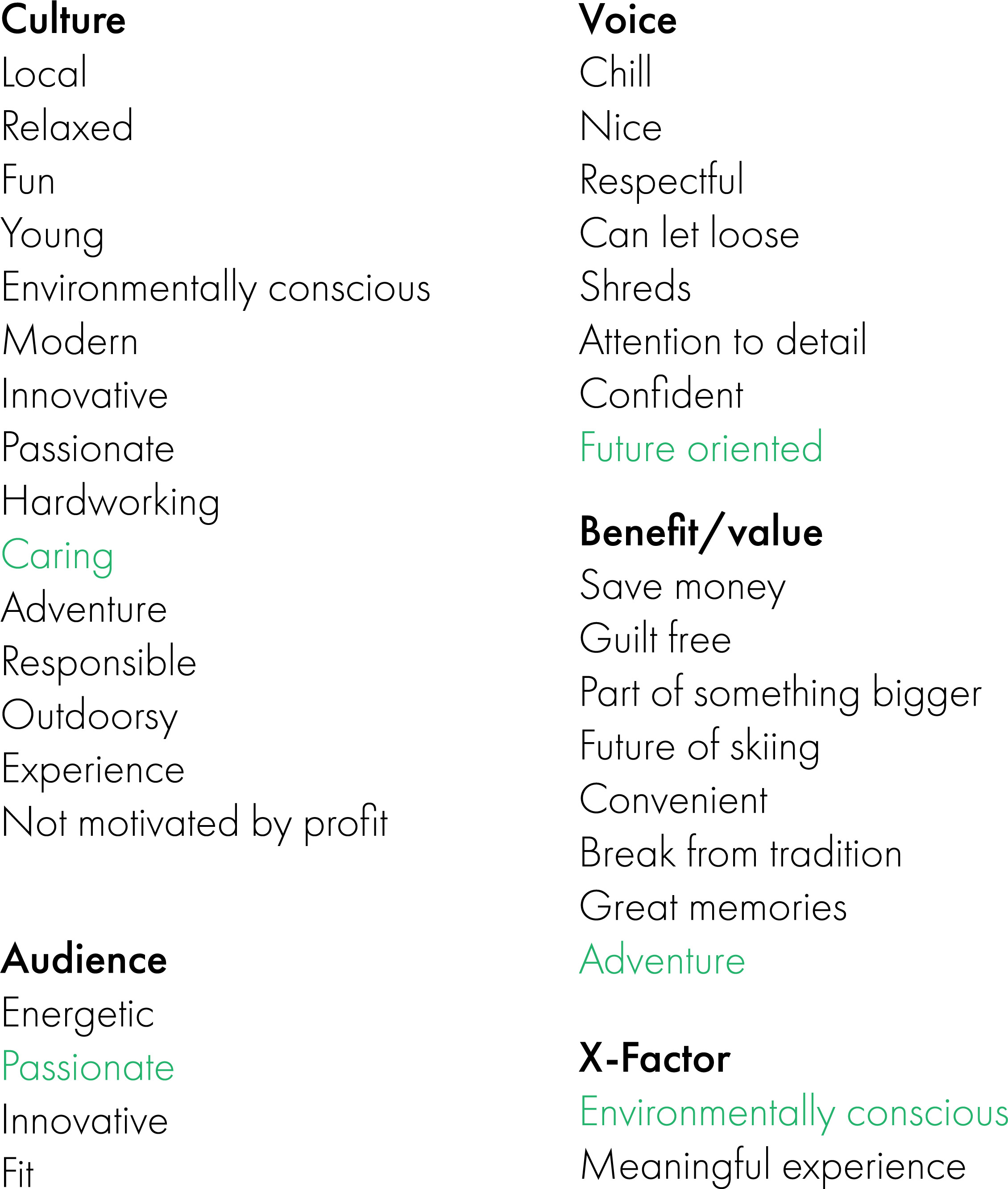
Defining the brand narrows the focus for the rest of the project. Defining the brand also gives an objective goal to aim for. Once an objective is determined I check my design work against it to easily see if my decisions strengthen or hurt the brand.
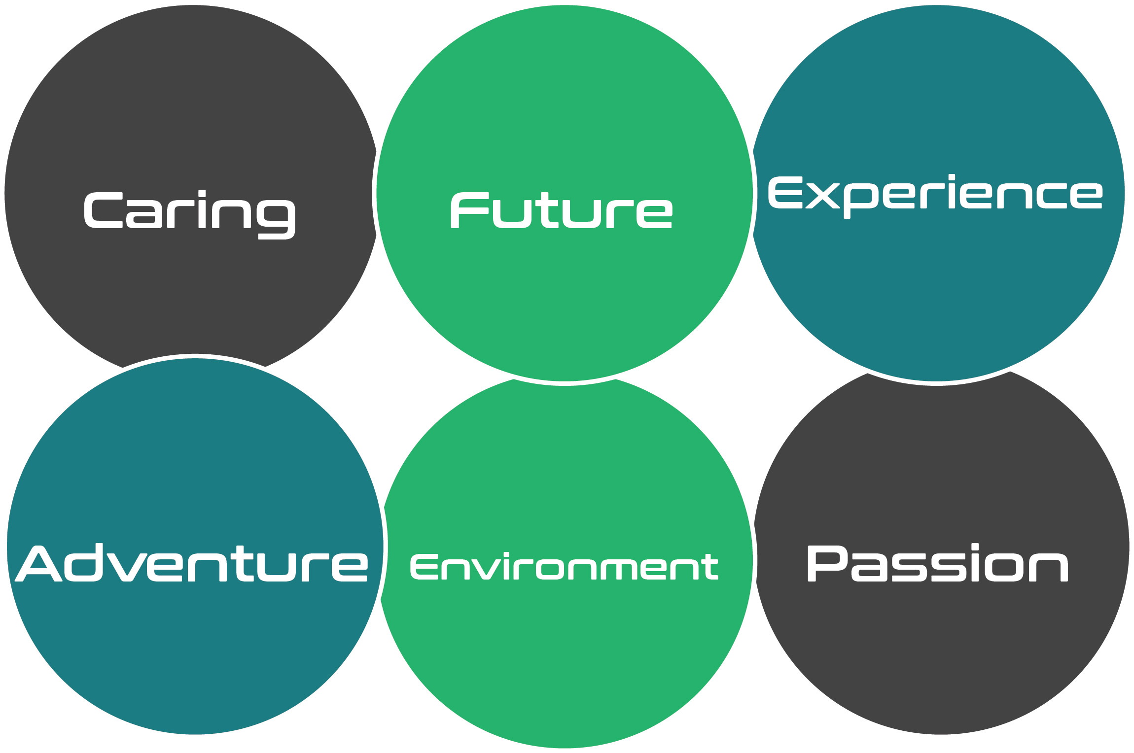
Defining the Brand

Typography/Colors
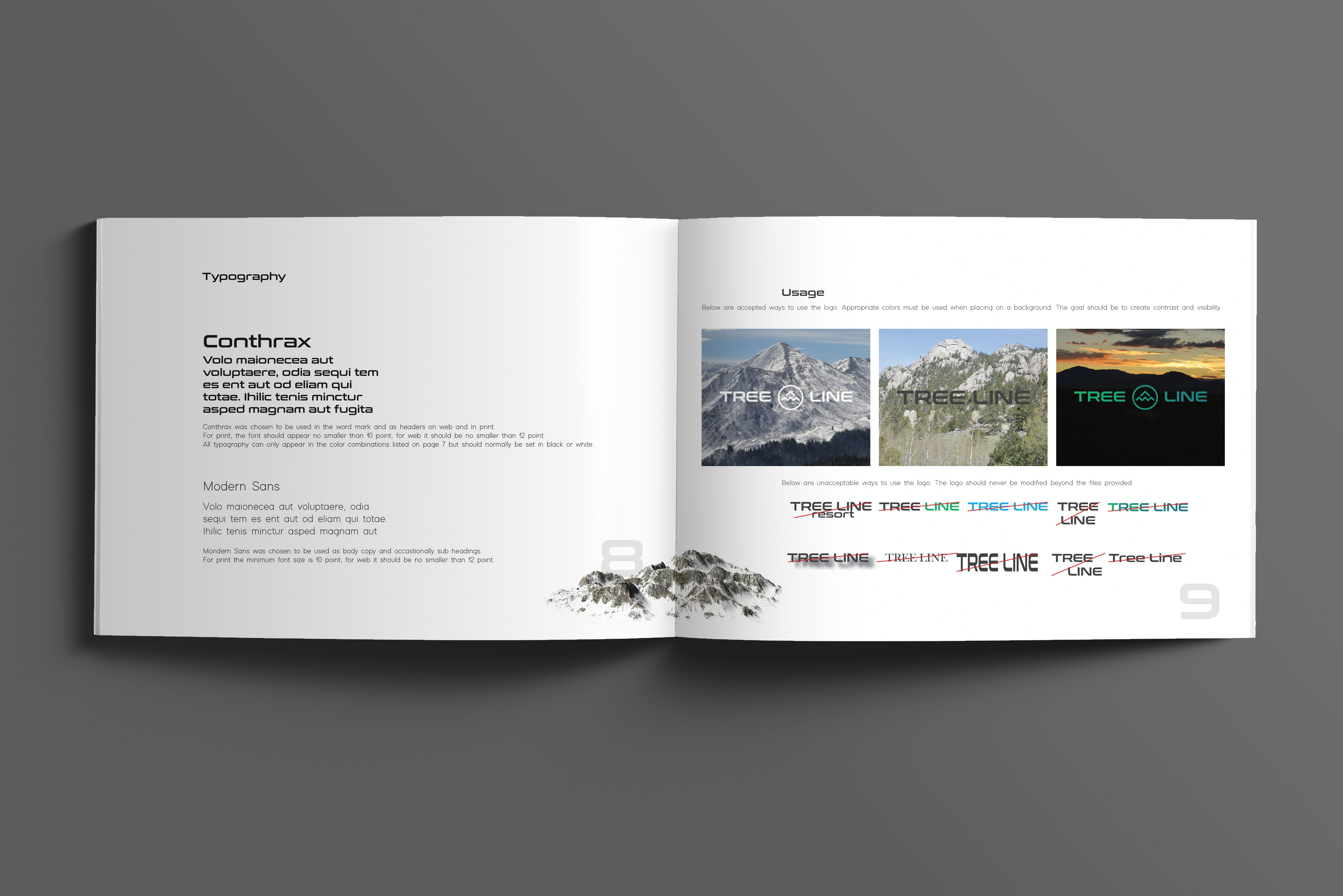
The main font used in the word mark resembles fonts used by NASA. It represents the futuristic forward thinking and innovation of the brand.

The secondary font remains as clean and professional as the first. Professionalism is important to the brand because it reassures customers that the adventure they paid for is safe and legitimate.

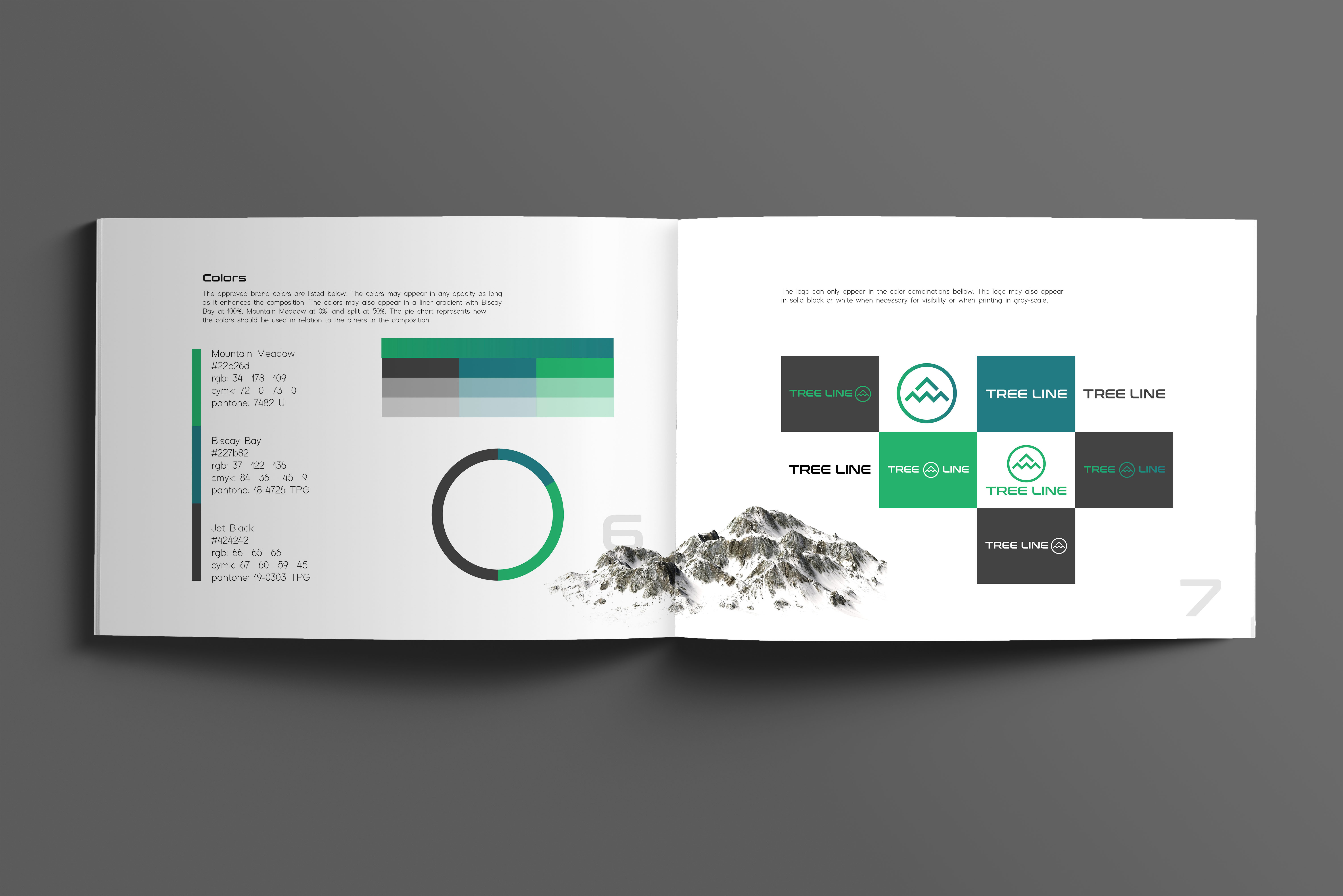
Green represents Tree Line’s responsibility to protect the environment and its customers. Blue represents the energy, passion, and youth of Tree Line. The high contrast colors, especially against jet black and white, create an eye catching and exciting look that will stand out against the competition.

Logo Drafts/Final
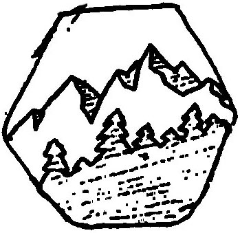
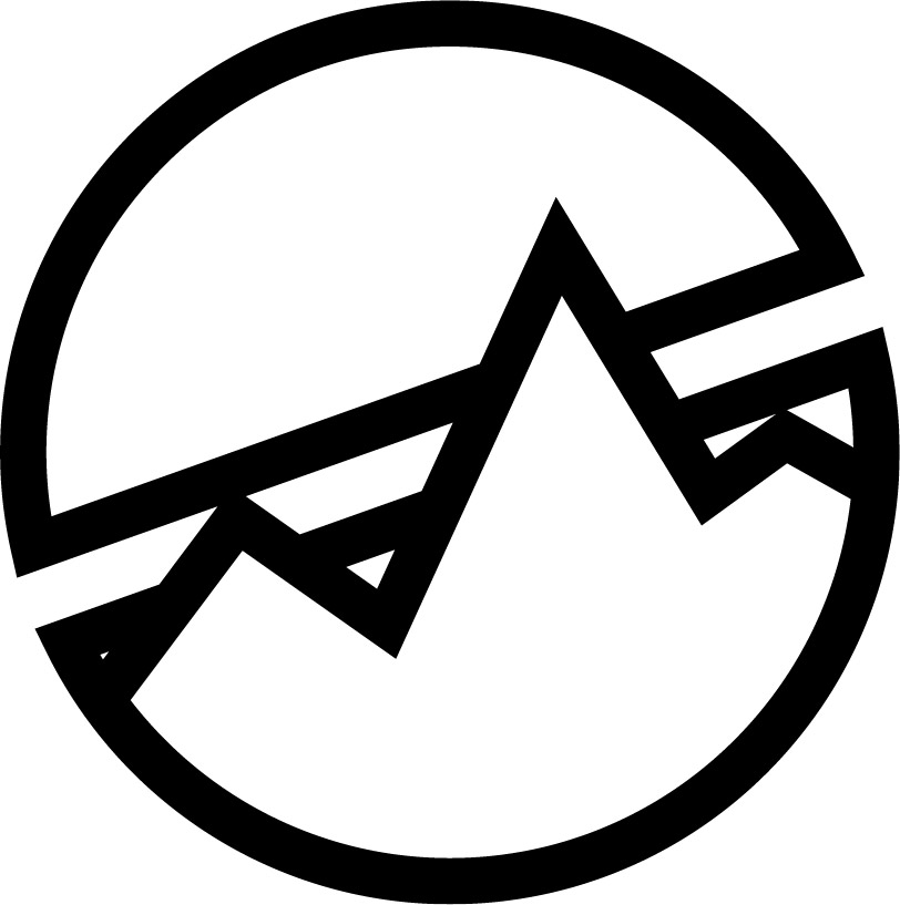
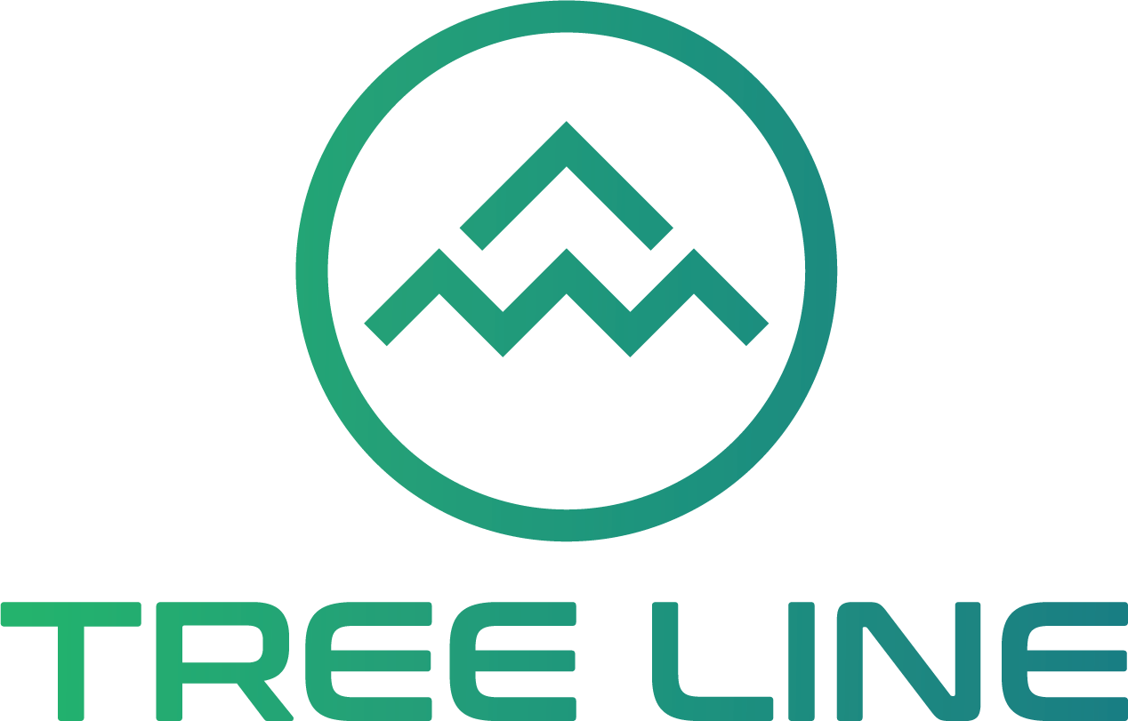
The Tree Line logo stands out in a competitive market and will last for years. The gradient, when combined with the mountain/arrow, communicates moving forward and away from tradition.
Drafts


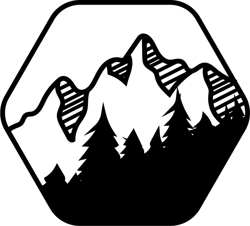

Final
Brand Usage Guide
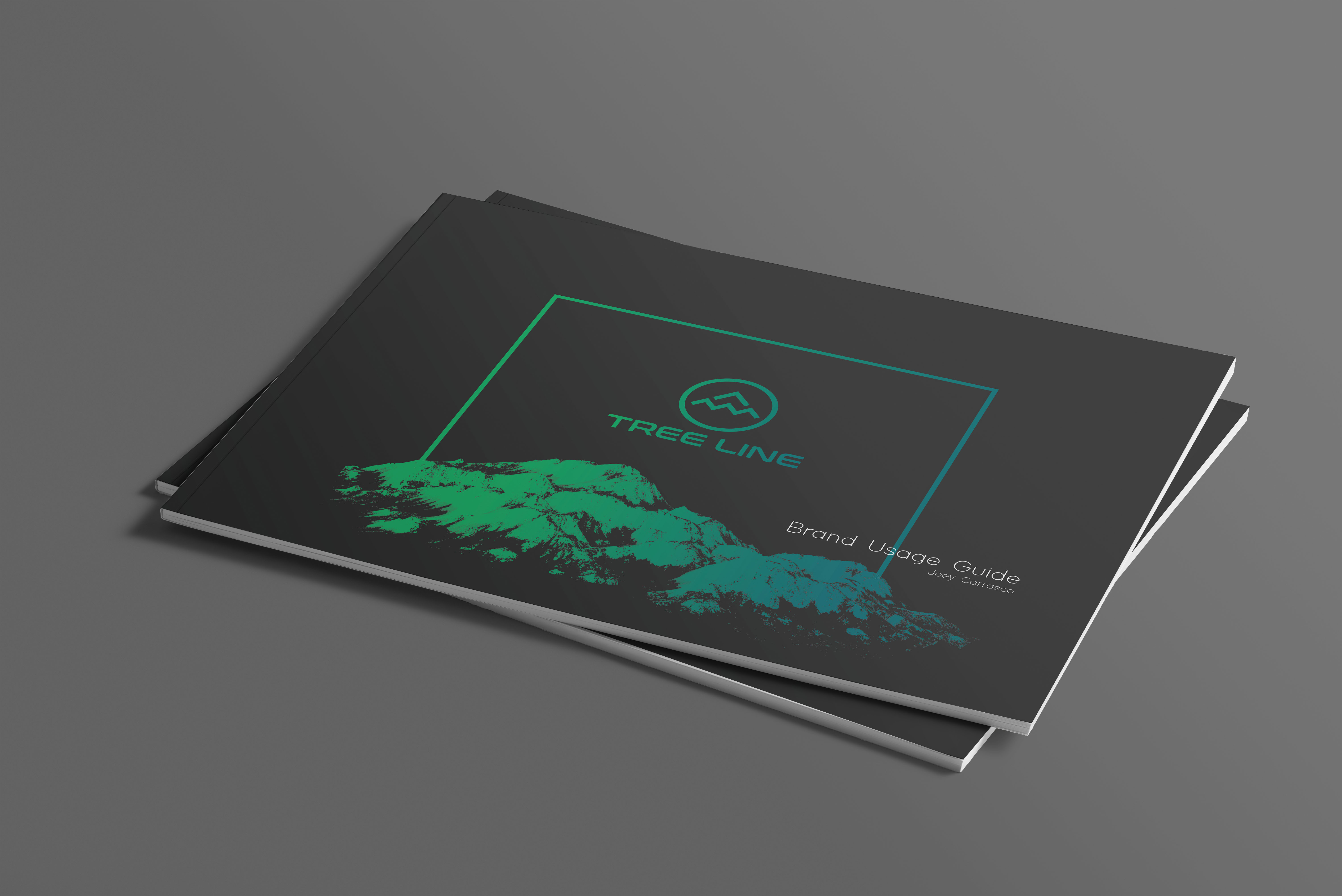
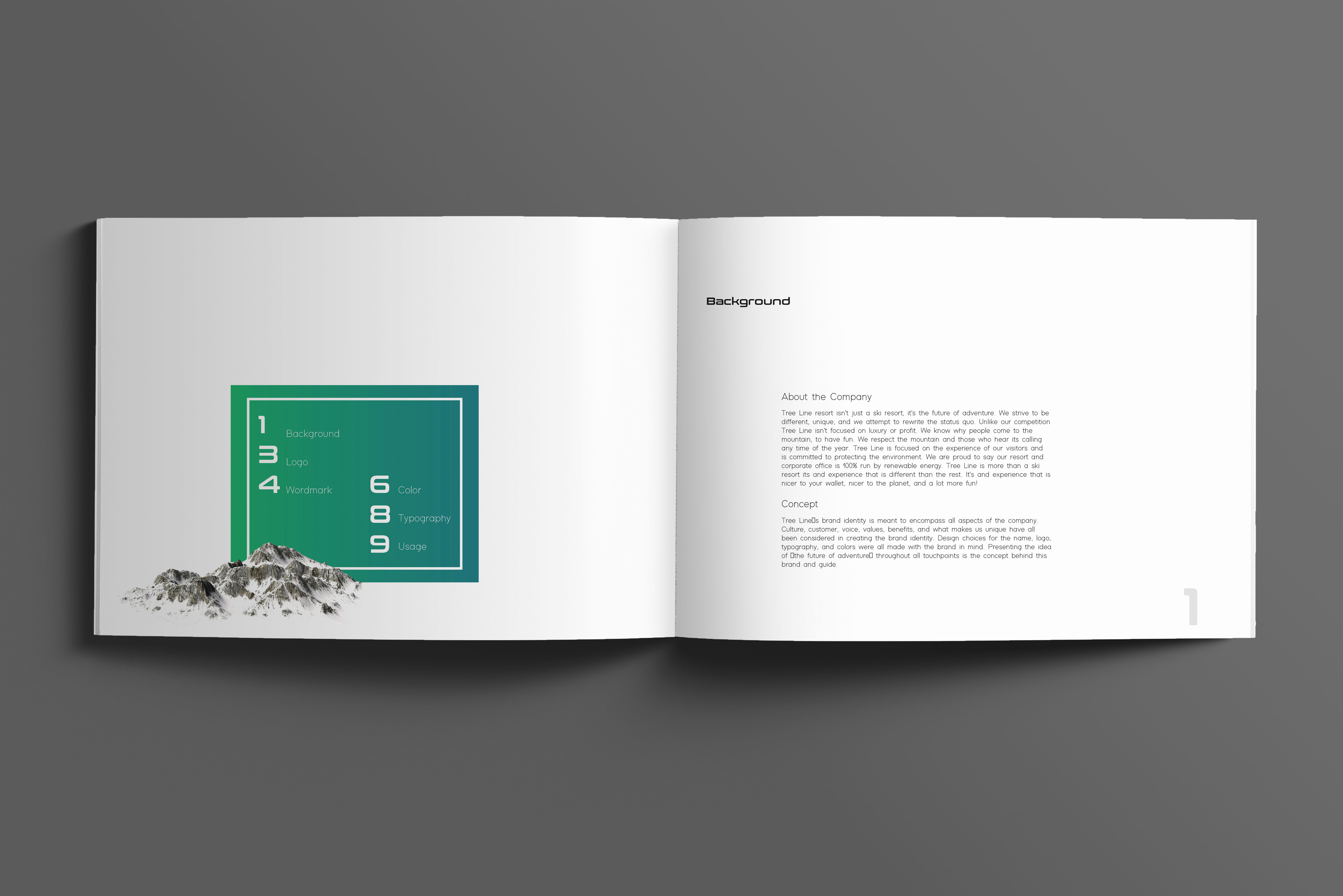
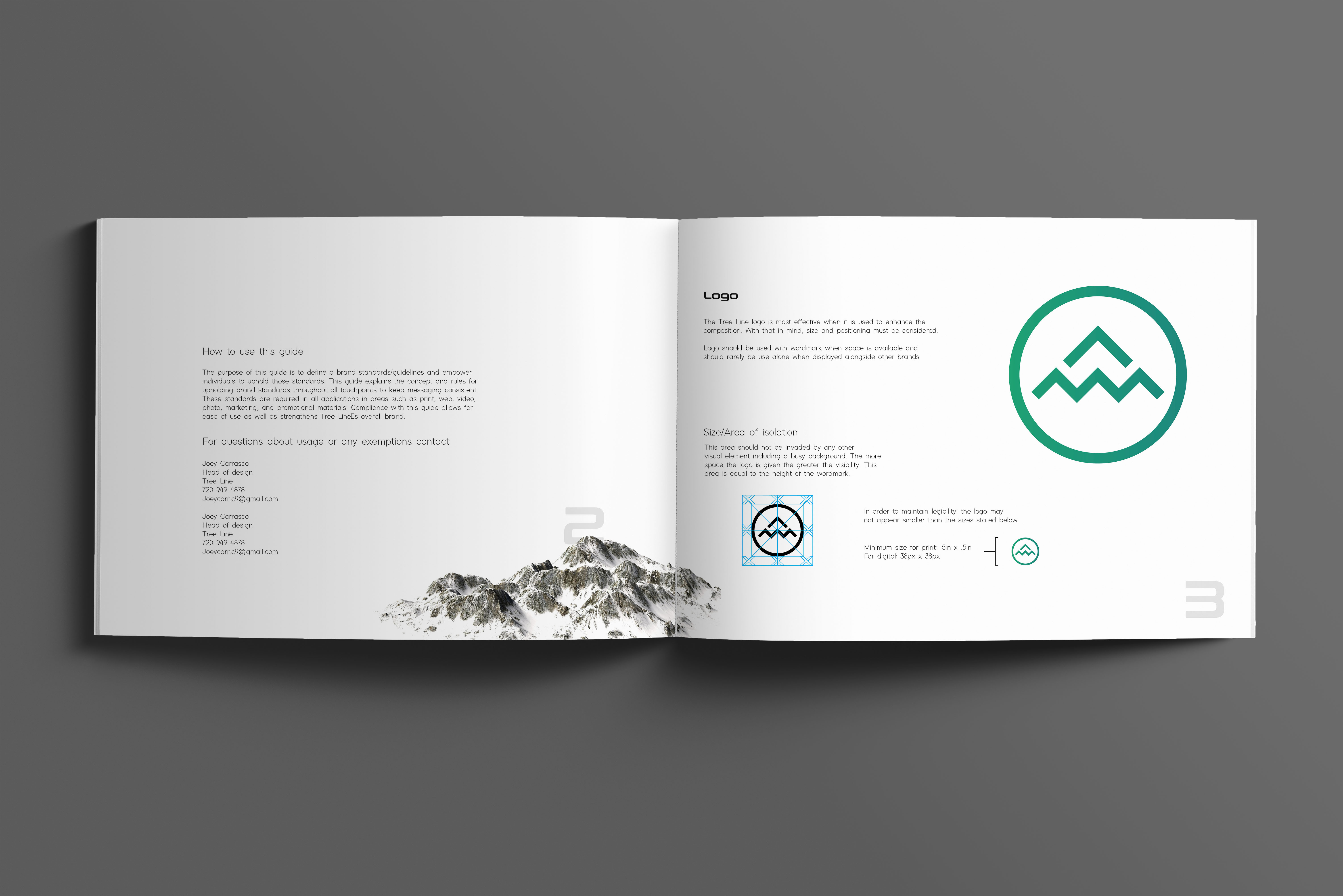
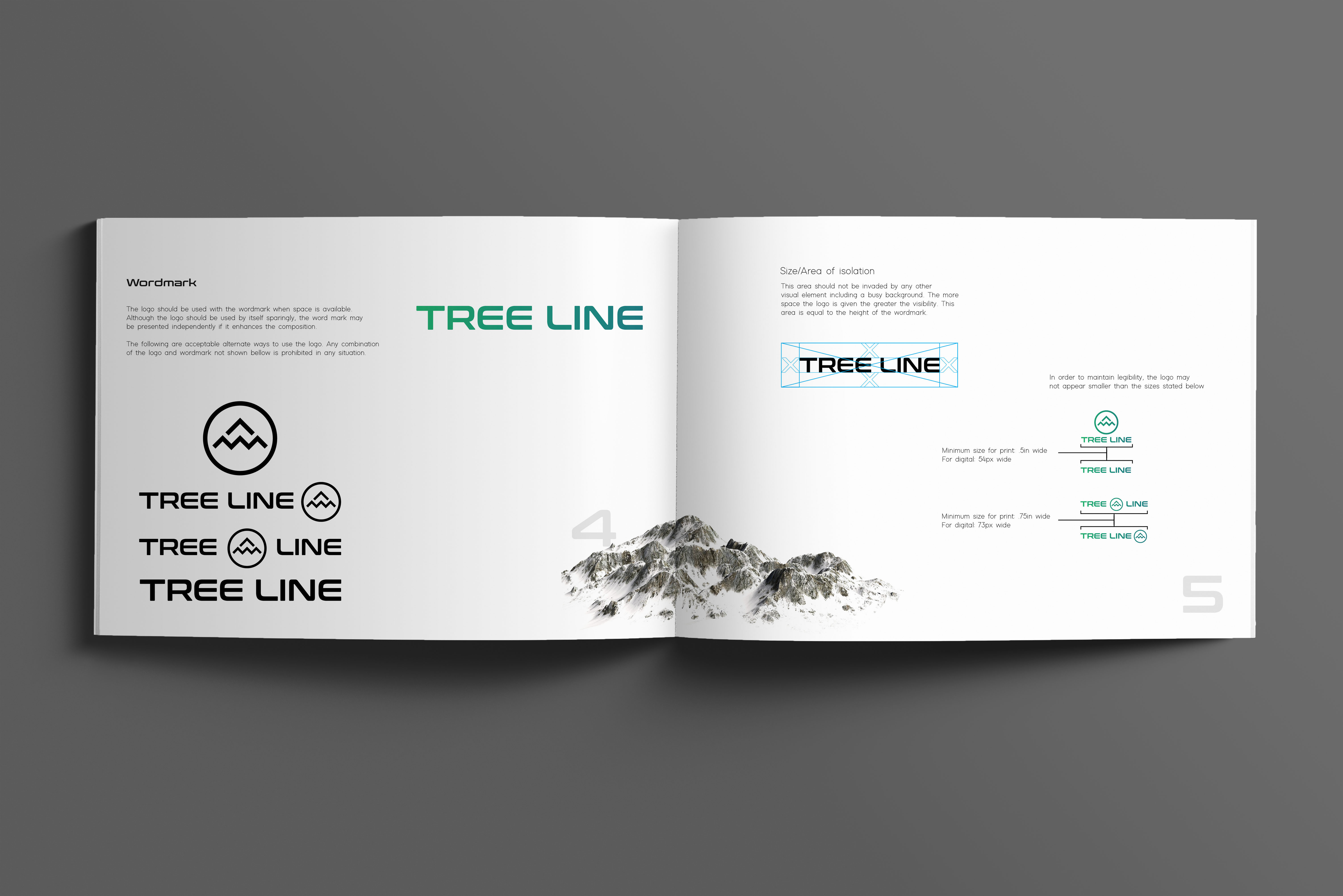
The purpose of this guide is to define brand standards/guidelines and empower individuals to uphold those standards. This guide explains the concept and rules for maintaining brand standards throughout all touchpoints to keep messaging consistent. The guide allows for ease of use as well as strengthens Tree Line’s overall brand.
 HOME
HOME